'Seagems identity refinement'
This project involved the identity redesign for Seagems, a Norwegian seafood company. My work included refining their heritage logo, designing key color palettes, creating new icons, and developing a PowerPoint template and brand guidelines.
For the logo, I focused on modernizing it while preserving its heritage. I refined the design by eliminating unnecessary repetitive elements, making the logo simpler and more modern. I kept the essence of the original design, ensuring it reflected Seagems’ rich history. The main color used throughout the design is Seagems' signature red, with a complementary blue as an accent color to represent the sea.
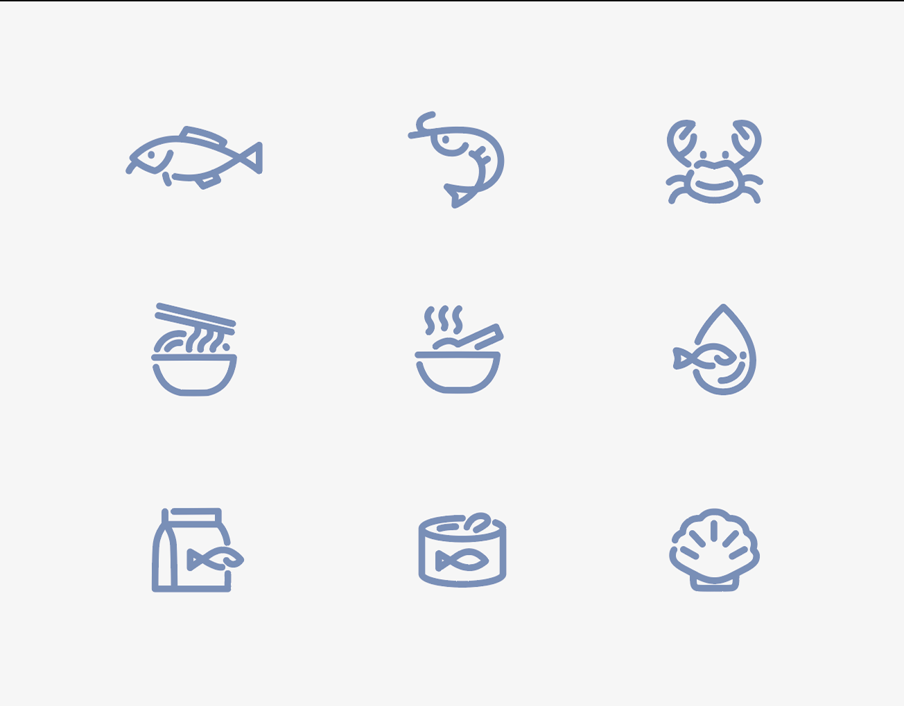
Additionally, I crafted a set of custom icons and provided a comprehensive brand guideline to ensure consistency across all visual materials.
PROJECT: Brand identity renewal
TYPE: Freelance Project
CLIENT: Seagems norway
ROLE: Graphic designer
